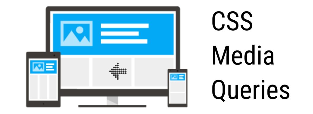
Media Query is popular CSS feature introduced in CSS3. It is used to display different styles conditionally based on what device or media a web page is being displayed i.e. for Responsive Web Designing (RWD). Using media queries you can define break points to force some web page elements behave differently in different devices based on device width.
Media Query Syntax:
A media query consists of an optional media type and break-point condition. Multiple queries can be combined in various ways by using logical operators. Media queries are case-insensitive.
@media media type and (condition: break-point) {
  // CSS Rules
}
If the break-point condition and/or media types meet, then the CSS rules inside the media query will be applied, otherwise, they won’t.
There are 4 different media types:
all– for all media typesprint– for printersscreen– for computer screens, tablets and, smart-phonesspeech– for screen readers (that reads the page out loud)
Example:
.text {
    font-size: 16px;
}
@media screen and (max-width: 480px) {
  .text {
    font-size: 12px;
  }
}
In the above example, using media query we are targeting devices having width upto 480px. So, this will reduce the font size of the element with class .text to 12px whenever the break-point condition is met (i.e device max-width upto 480px). For all other devices the font size will remain 16px. This is just one simple example. We can write much more complex media queries.
/ * Target all mobile devices */
@media all and (max-width: 480px) and (min-width: 320px) {
  body {
    background: #ccc;
  }
}
Here are few media query break-points for different devices:
- 320px – 480px: Mobile devices.
- 481px – 768px: iPads, Tablets.
- 769px – 1024px: Small screens, laptops.
- 1025px – 1200px: Desktops, large screens.
- 1201px and more – Extra large screens, TV.
Note: Always place all your media queries at the end of the CSS file.